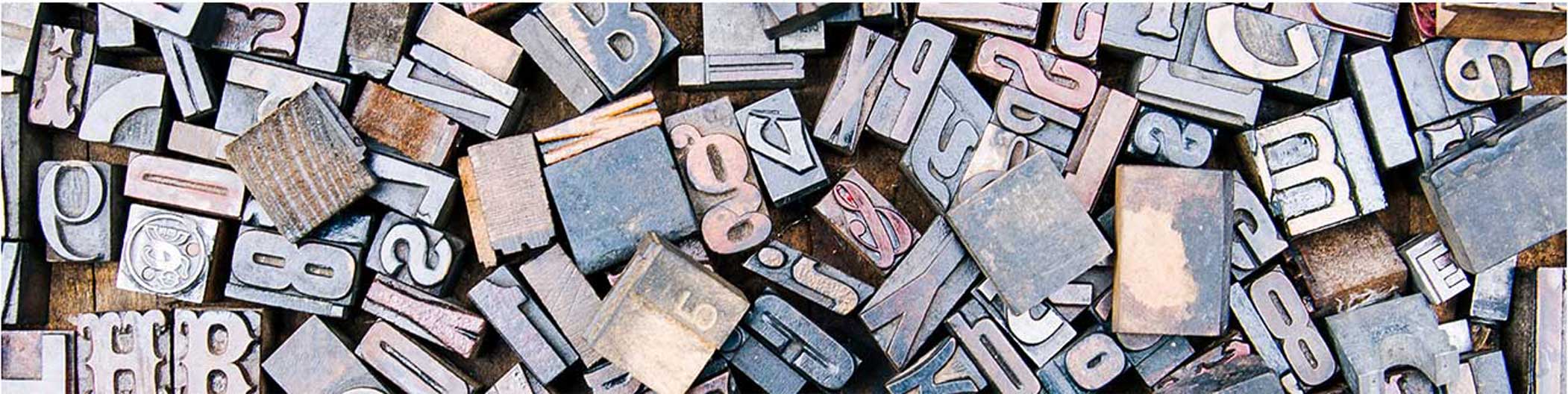
Typography
Any complete artwork consists of many elements to make it look perfect. Whether it be graphics, images, videos, colours and anything else. Fonts and typography plays an important role in enhancing any design and making it informative.
What is typography?
Typography is everywhere we look. The arrangement of letters and text in such a way that it makes the copy legible, clear, and visually appealing to the reader is known as typography. It involves different typefaces, font styles, appearances, layouts and structure, whose aim is to create certain emotions and convey specific messages to the reader. In other words, typography helps us to put life into a soulless text.


What is typography?
Typography can be seen almost everywhere. The way your phone looks. When you see a billboard, or even your coffee cup, everything contains typography. Typography is so much more than just choosing beautiful fonts. The arrangement of every font, letter, and character plays an important part in determining how a message is conveyed. The selection of fonts can be seem a little difficult at times, but even the smallest change in type of font can impact the look and feel of your work immensely.
By good typography, a strong visual hierarchy can be established. It can provide a graphic balance to the website, and is very good to decide the product’s overall tone. A good typography will allow the user to read and access the content easily.
Typography plays an important part in building brands also. When a brand uses particular fonts, colours, graphics, it becomes it’s brand language. People will recognize the brand as soon as they’ll see that particular font somewhere. The best example for use of typography for building brand is “vogue”. It’s logo is also made of simple typography.
Different elements of typography.
FONTS
The physical and graphical representation of text character or its collection is called font.
TYPEFACE
It is the group of similar fonts. For example – Clarendton is the Typeface. It’s variation in size, weight, style is font.


READABILITY
The first and the most important thing any reader will see in any kind of typography is the ability to read. One should use the easy to read and identify typefaces while reading a body text. Headings can be a little different than the body text and they are also big in size making the text more visible and easy to read.
ALIGNMENT
It is the positioning of text, graphics, images and other elements in the artwork. Every single element must be aligned in such a manner that overall artwork looks balanced and pleasant to eyes.


HIERARCHY
Hierarchy is a kind of ladder. To put into easy words, different styles and sizes of typefaces giudes the user, where to head first and which thing to read first, then the second, and then the third.
KERNING
Kerning is the space between specific characters.
LEADING
Leading is the vertical space between lines of text, also known as line spacing.
TRACKING
Tracking is the overall space between characters, sometimes called character spacing.
