Client
- Akari & Koko
} The rise of
Japanese design
Scope
- Branding
- Menus
- Tile wall
- Tiles
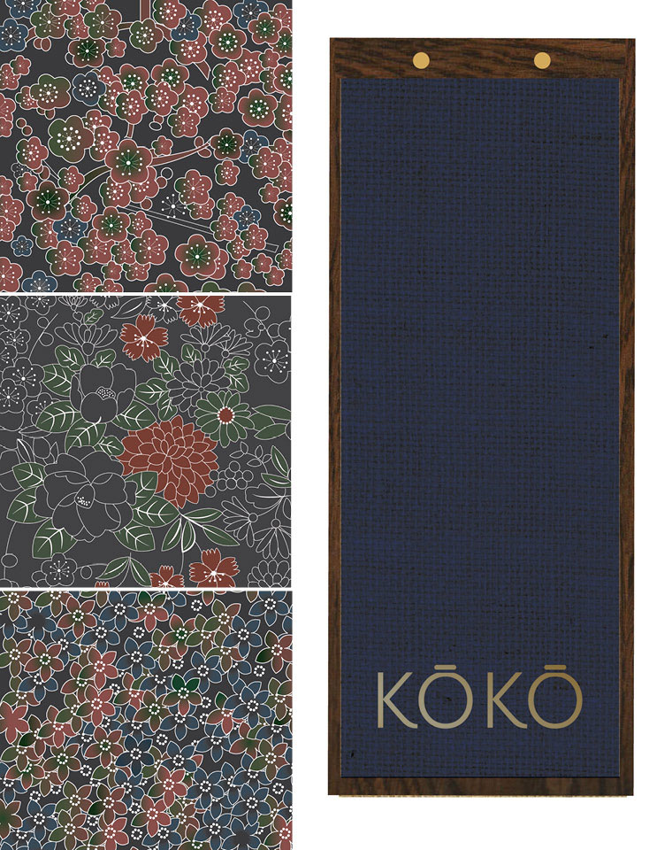
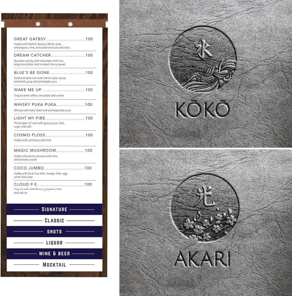
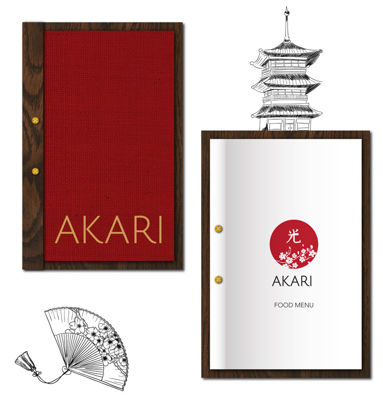
A restaurant & bar in Kathmandu, Nepal. The restaurant is called ‘Akari’ meaning ‘light’ in Japanese, the logo therefore played with Japanese character for light and elements like cherry blossom, red circle depicting the sun and Japan flag. Similarly, the bar ‘Koko’ means ‘liquid’ and the Japanese character stands for water and element of waves to portray the meaning and place.
We also design a large graphic wall for the pool side, with a Asian girl and elements among other deliverables