Client
- Shake
- Square
} Shaking the
design square
Scope
- Branding
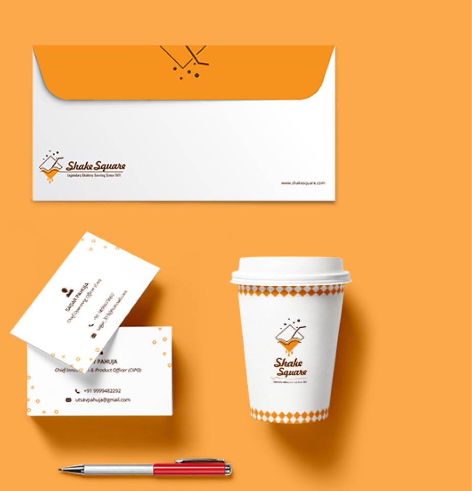
- Stationery
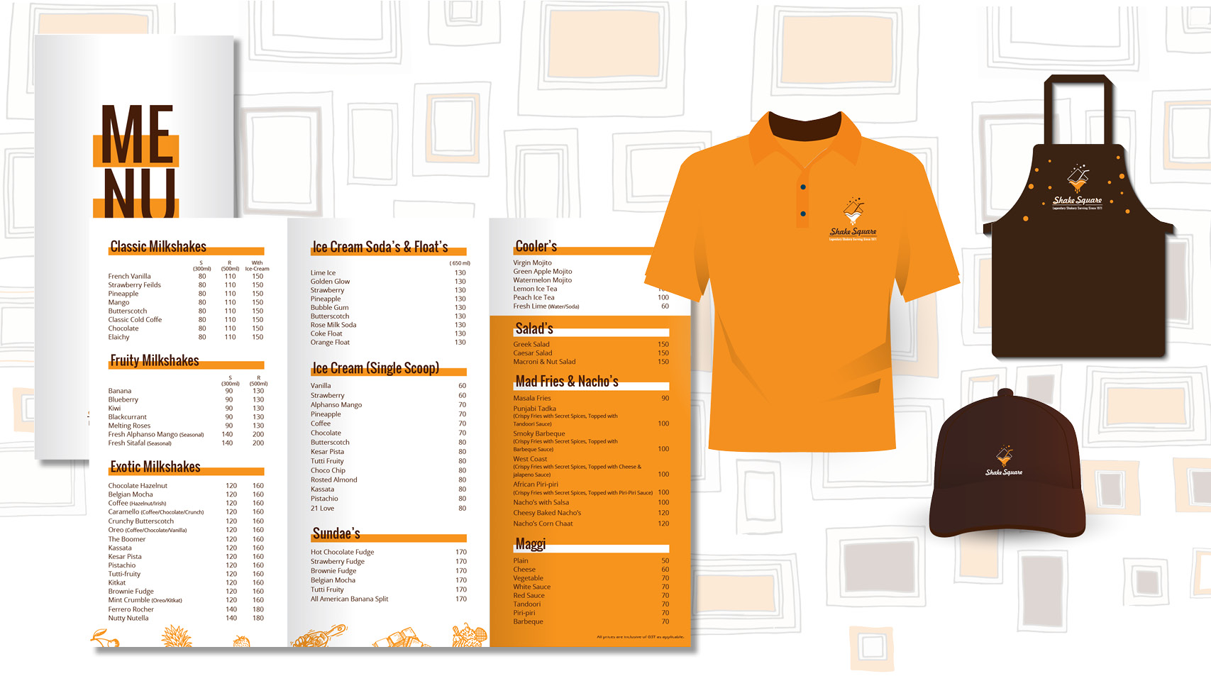
- Menus
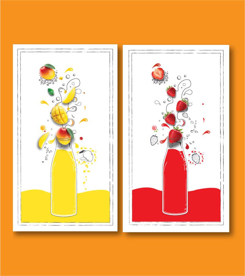
- Interior Graphics
- Signage
- Uniform
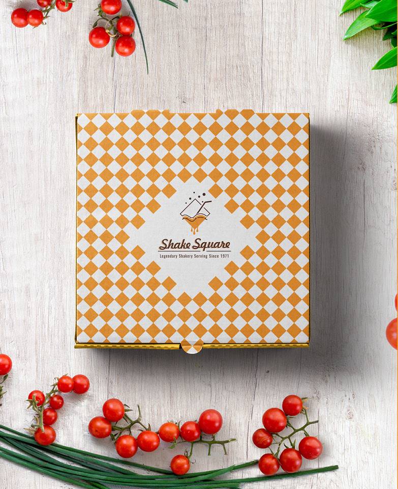
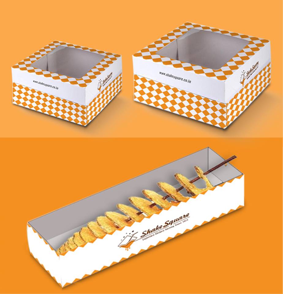
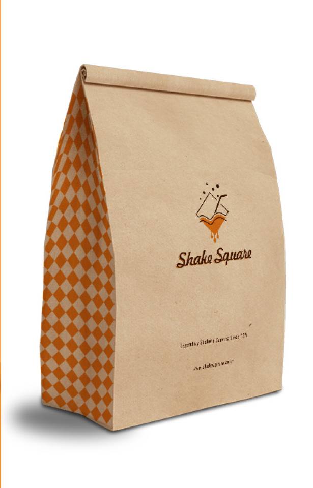
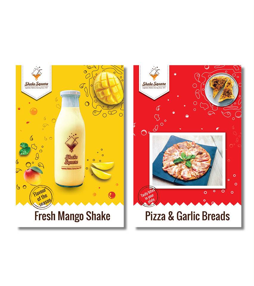
- Packaging
- Promotion
- Website
Shake Square as the name suggest serves the infamous shakes that
started in Connaught Place, Delhi, decades back. The brand has
been re-branded and expanding to various parts of the country.
We took square and milk (shakes) as a concept for the logo. For
the rest of the branding square pattern was explored and
incorporated in different styles. Three colours are used all
over the branding to give a synergy among all collaterals.

