Client
- Wai Wai City
} Noodle doodles
and café branding
Scope
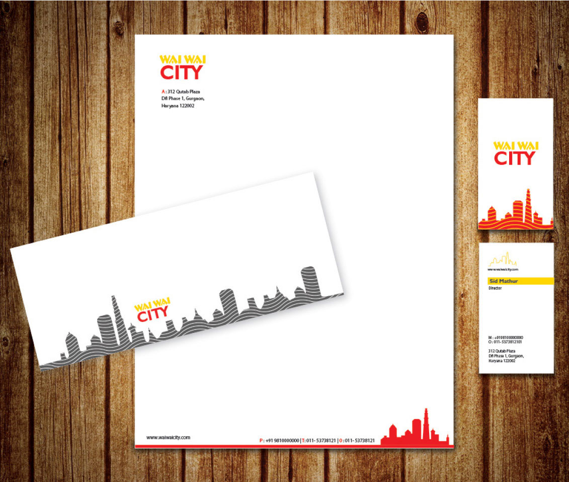
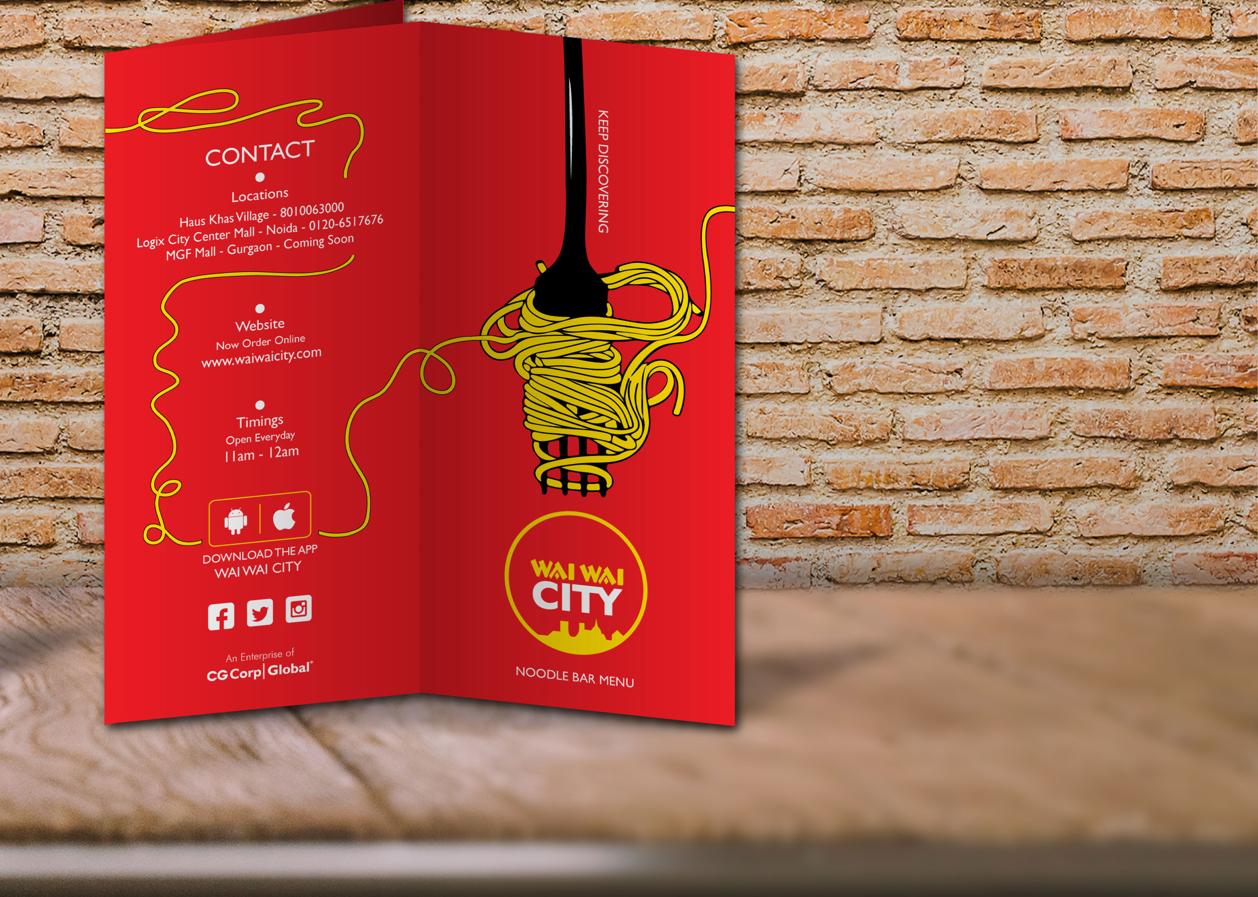
- Branding
- Stationery
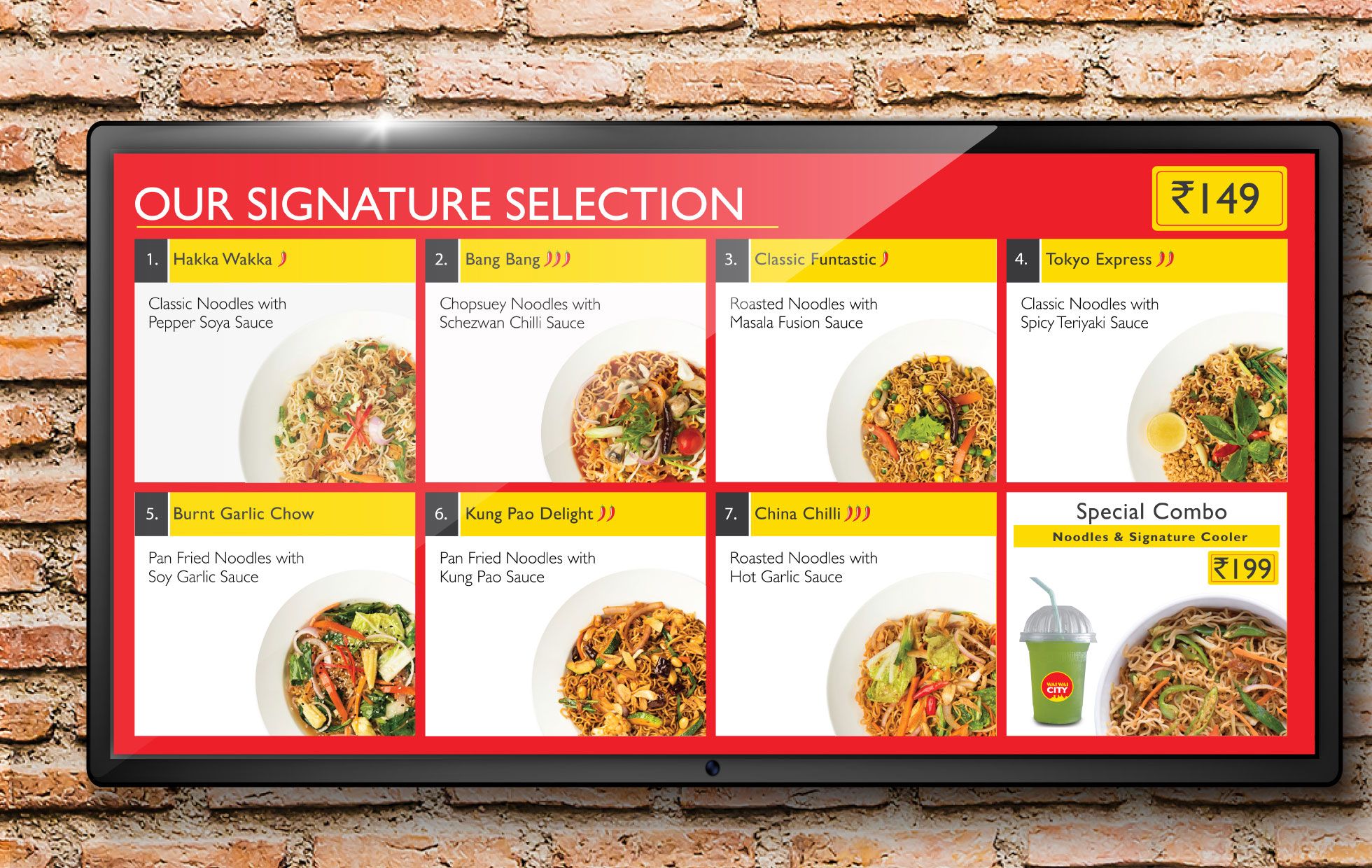
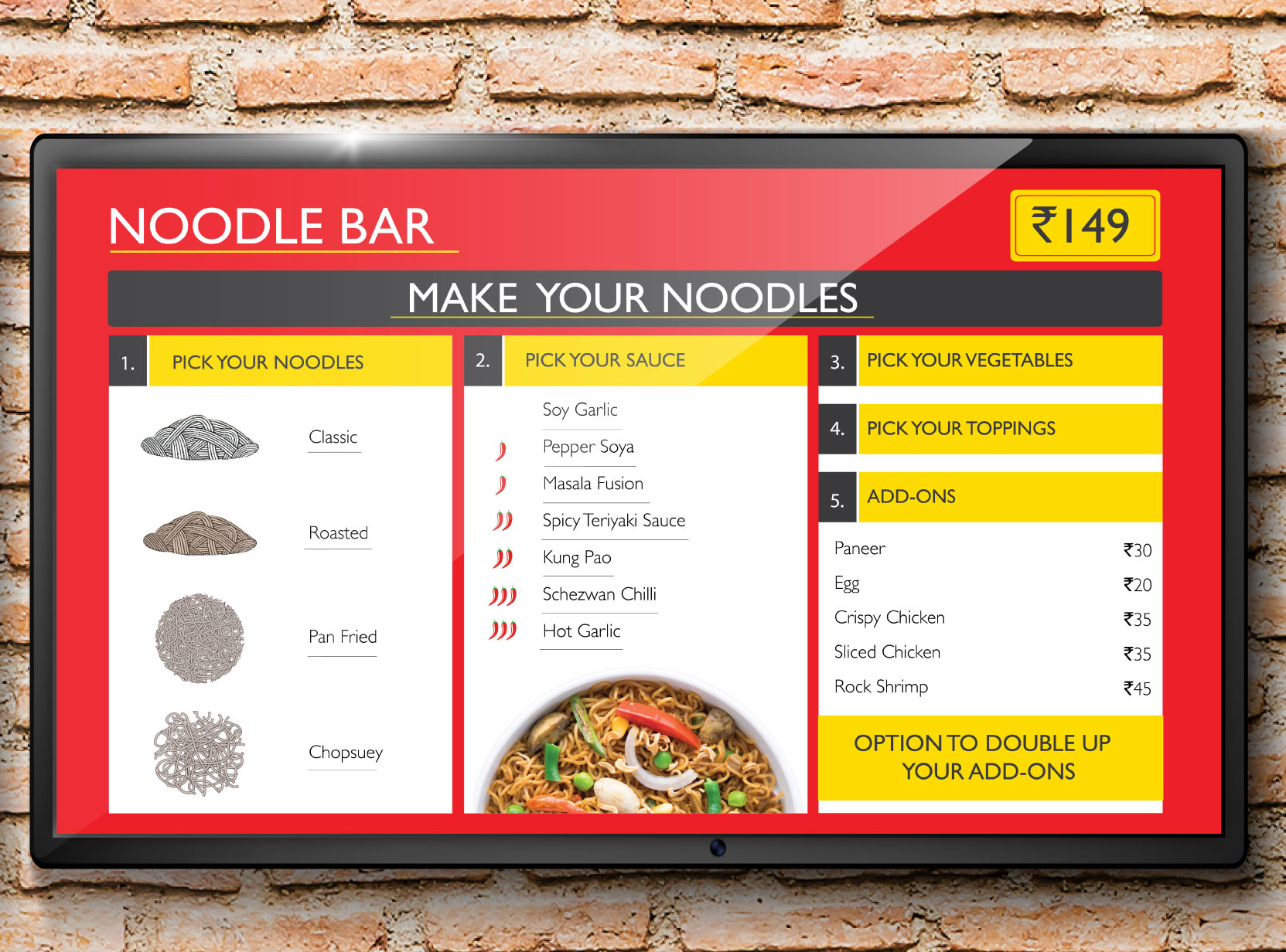
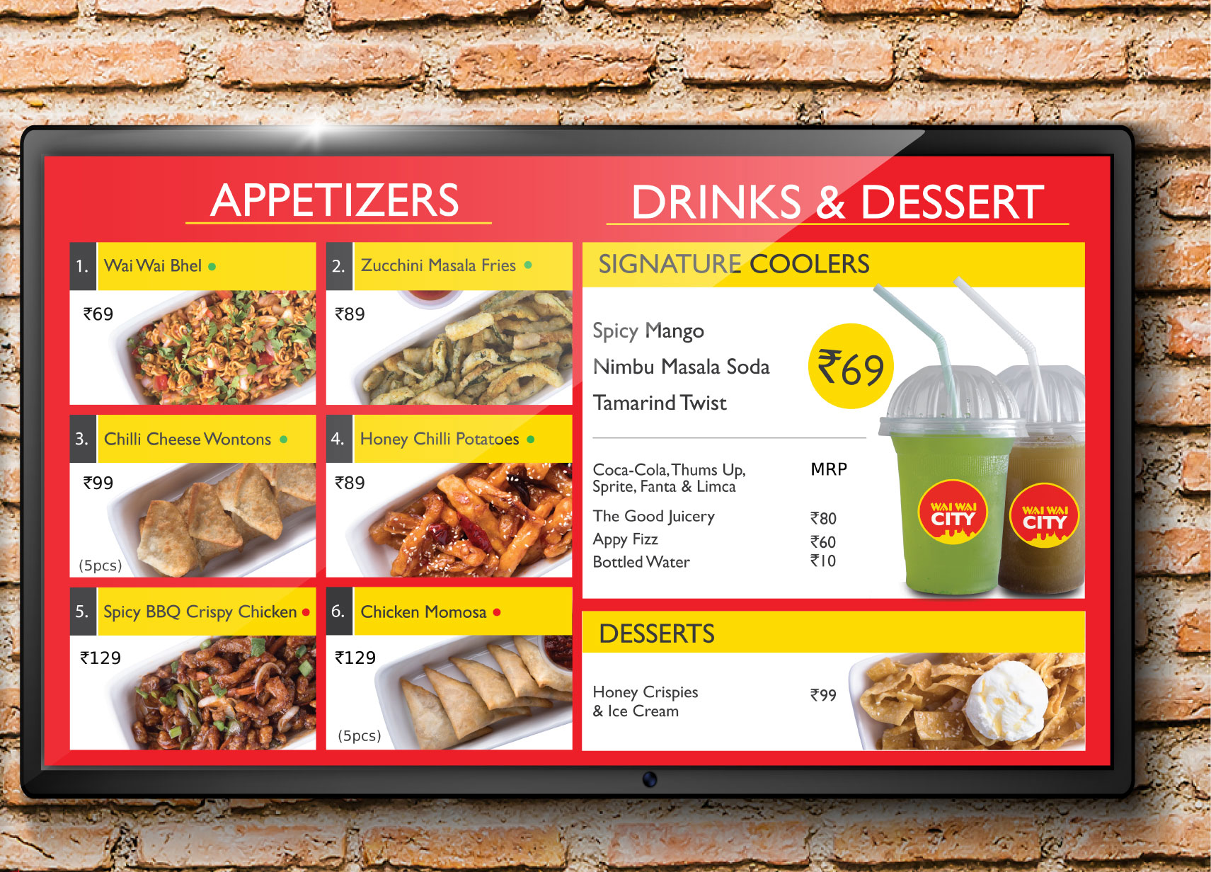
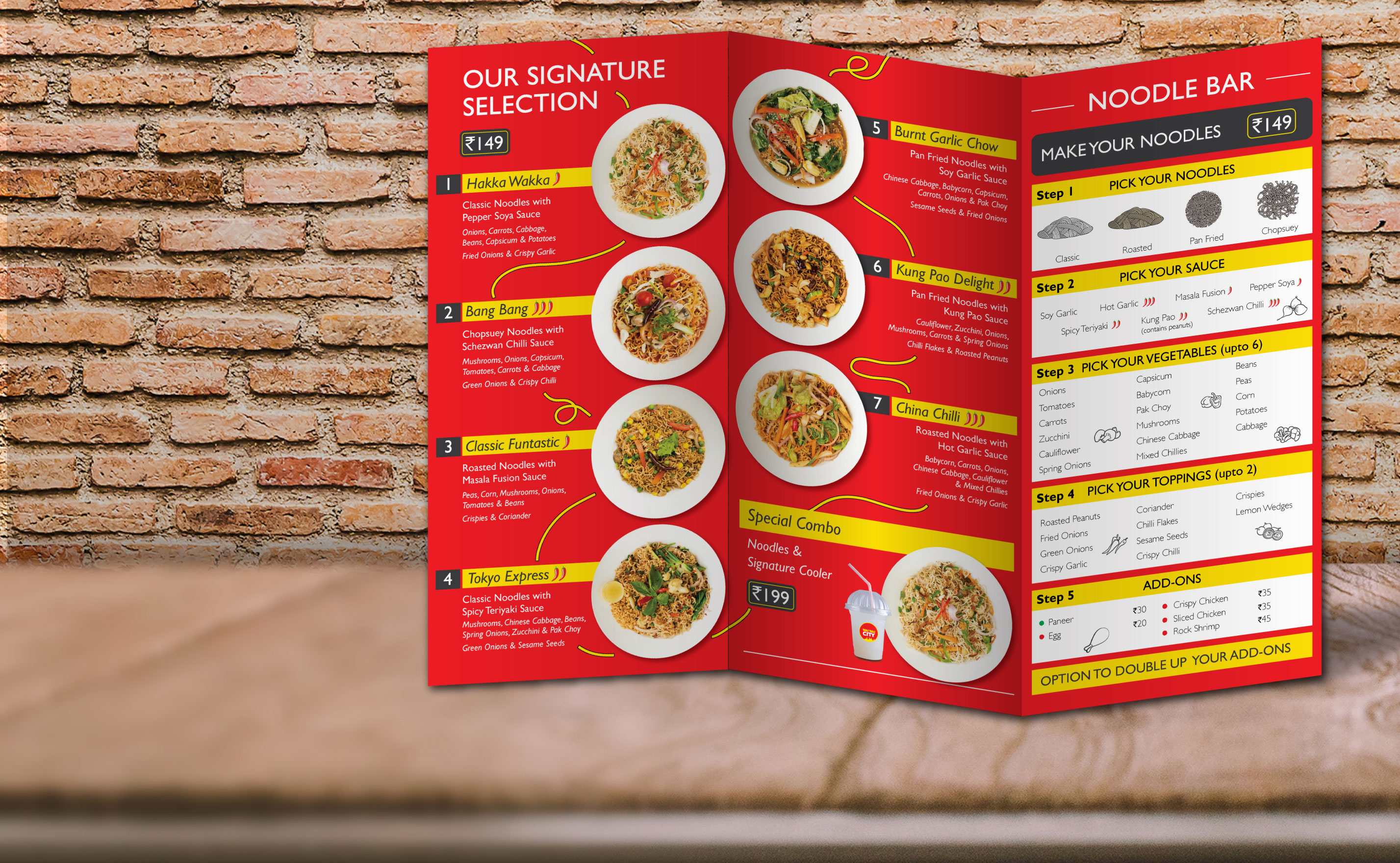
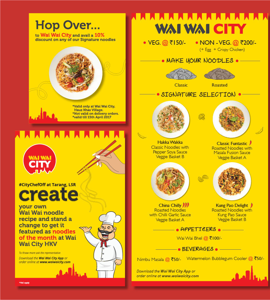
- Menus
- Interior Graphics
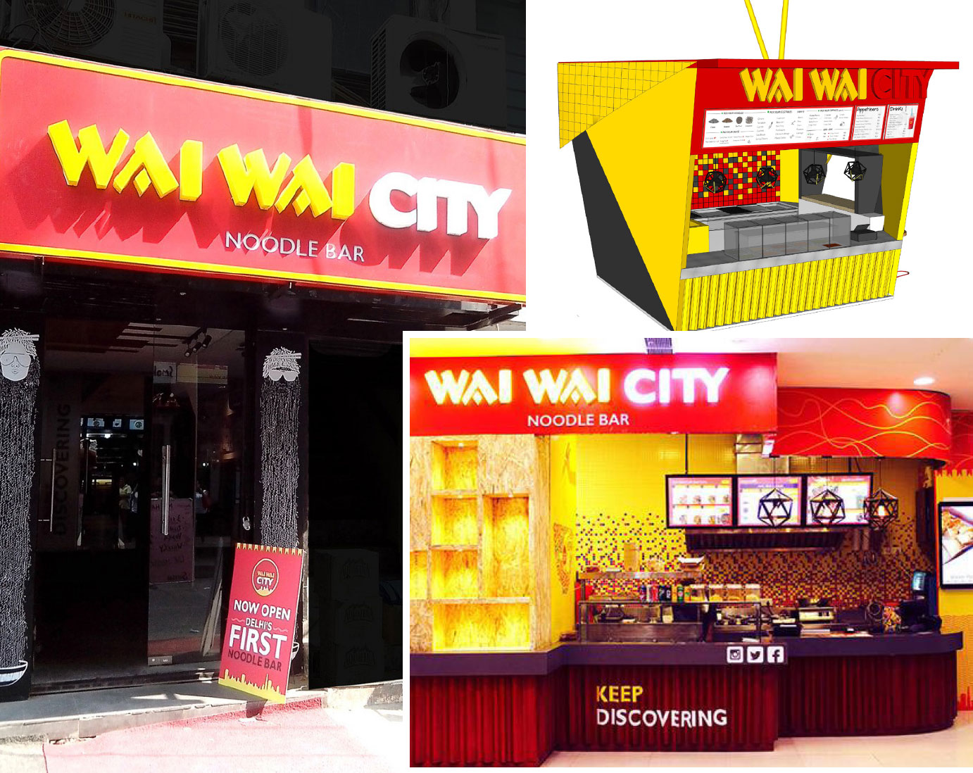
- Signage
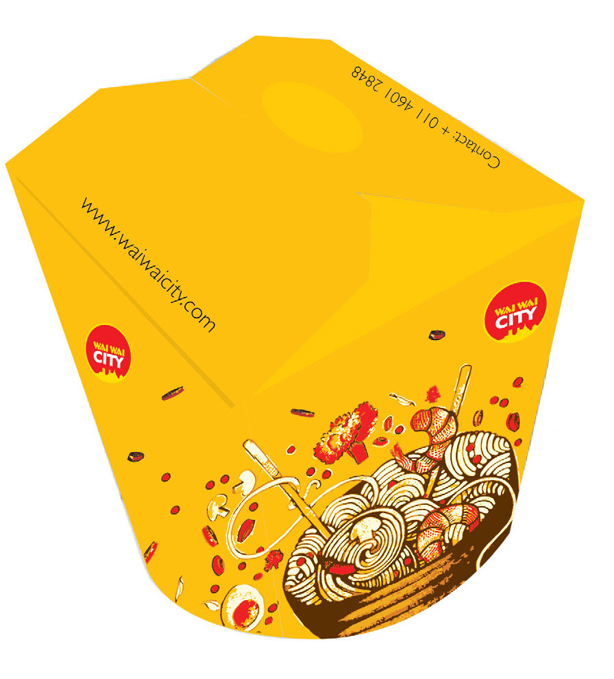
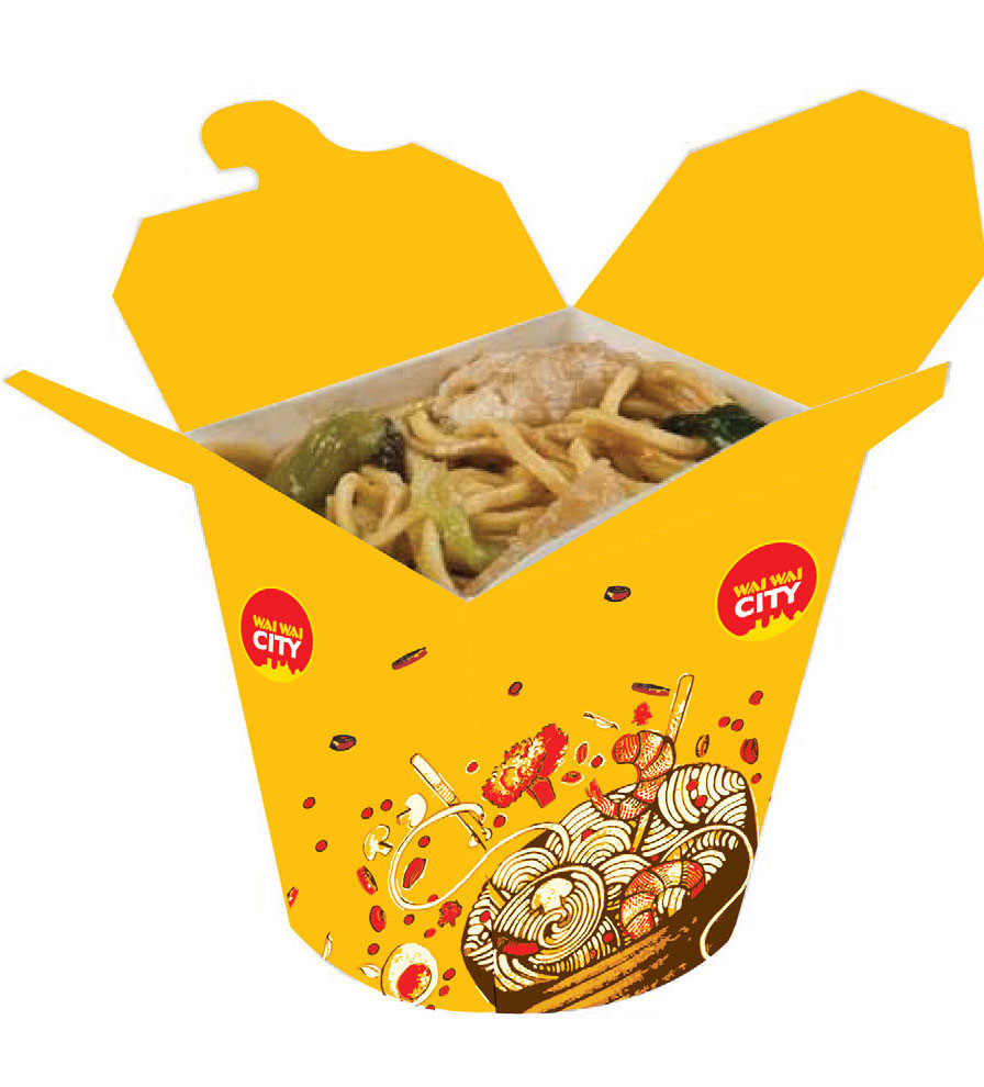
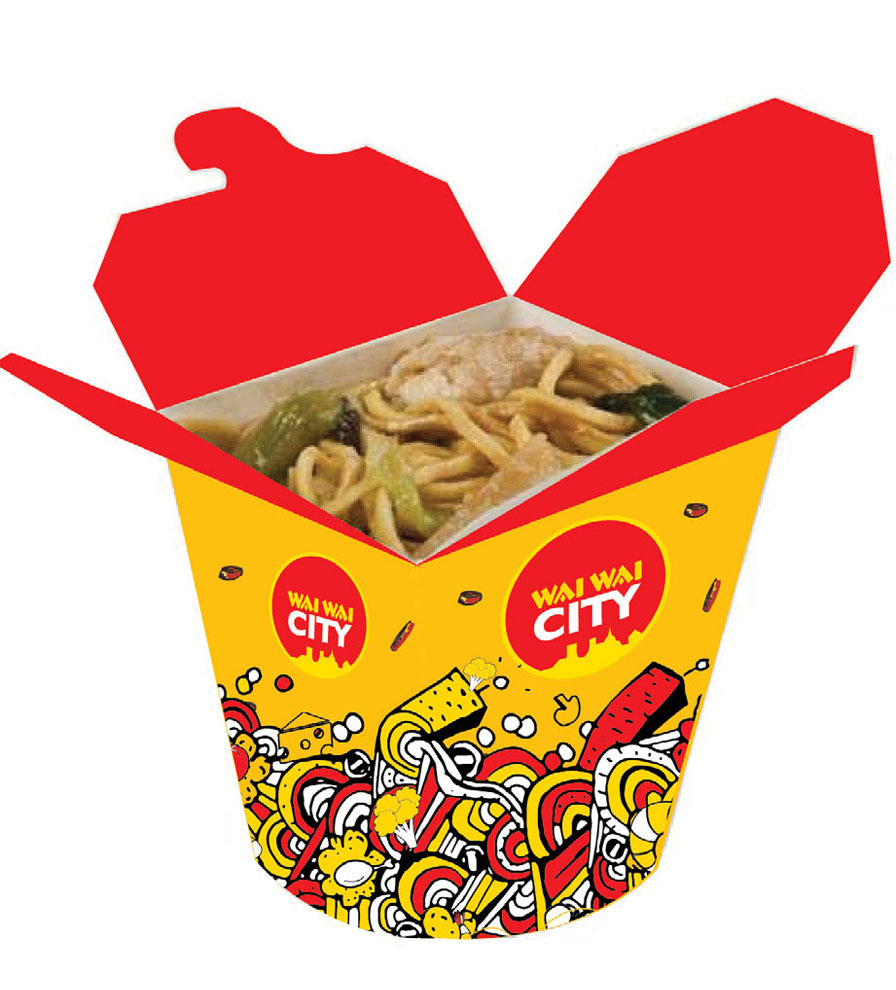
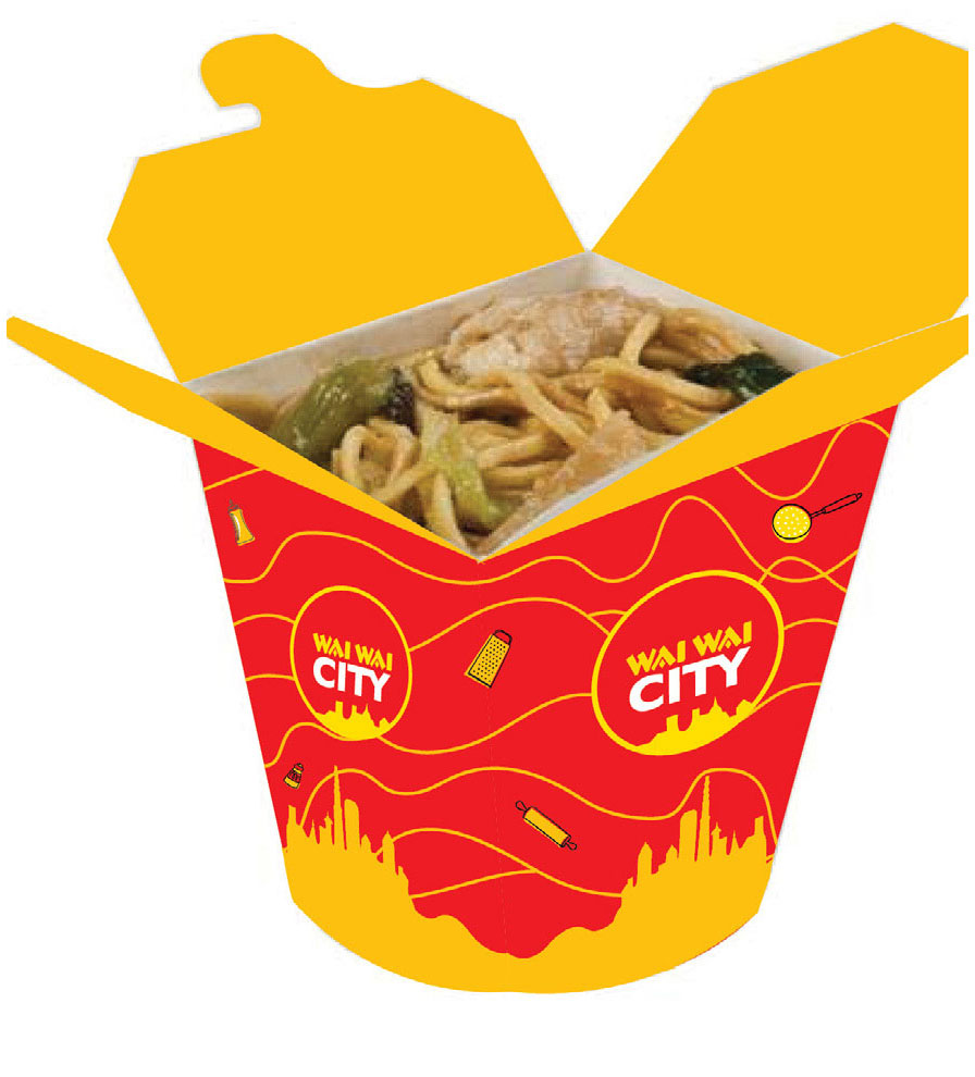
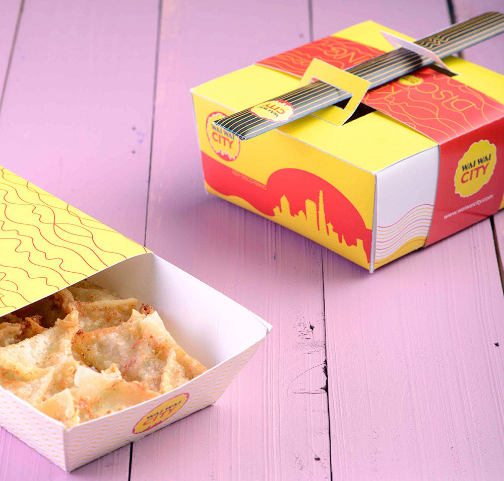
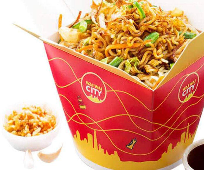
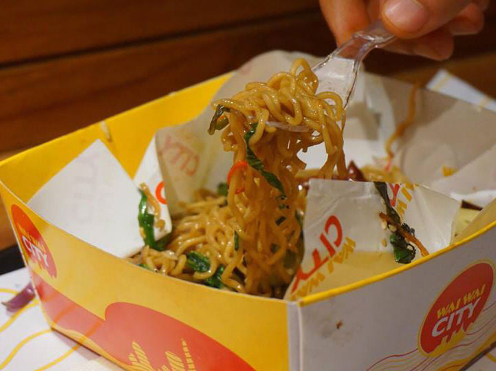
- Packaging
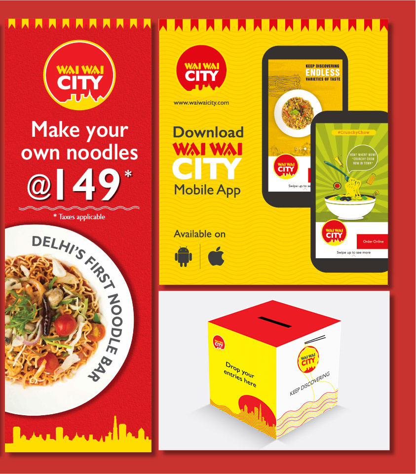
- Marketing Collaterals
- Event Design /Kiosk
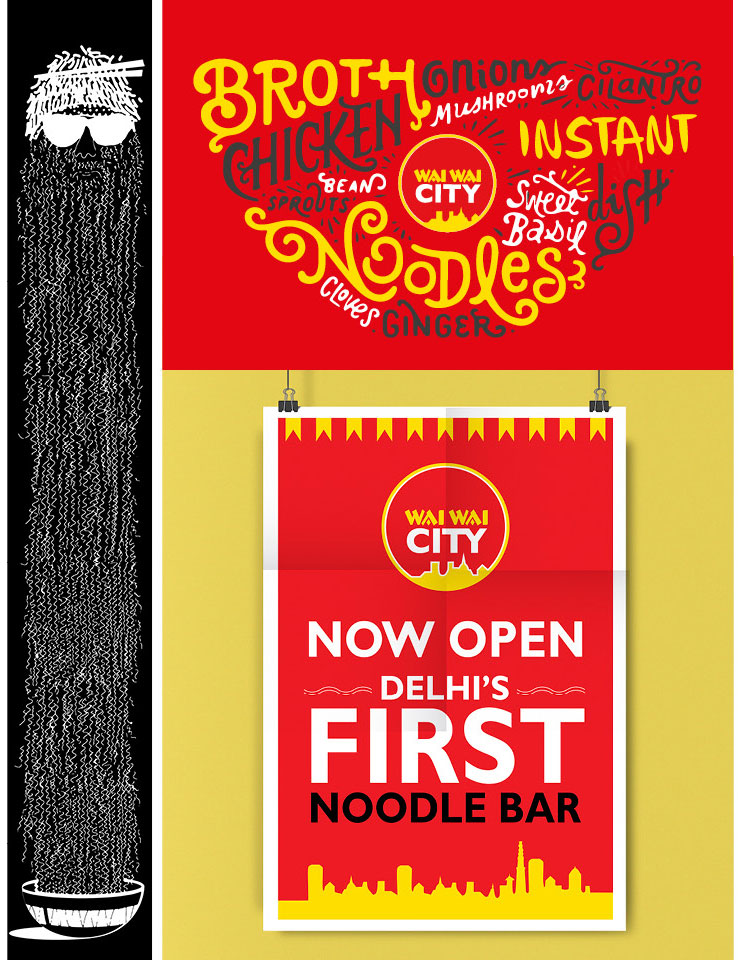
We have all known or eaten Wai Wai noodles in our lives. Now Wai
Wai has come up with its QSR cafe Wai Wai City as a first noodle
bar of Delhi. Since the original brand is from Nepal, we took
the skyline from Nepal architecture in logo also simply because
the name of the brand in Wai Wai City.
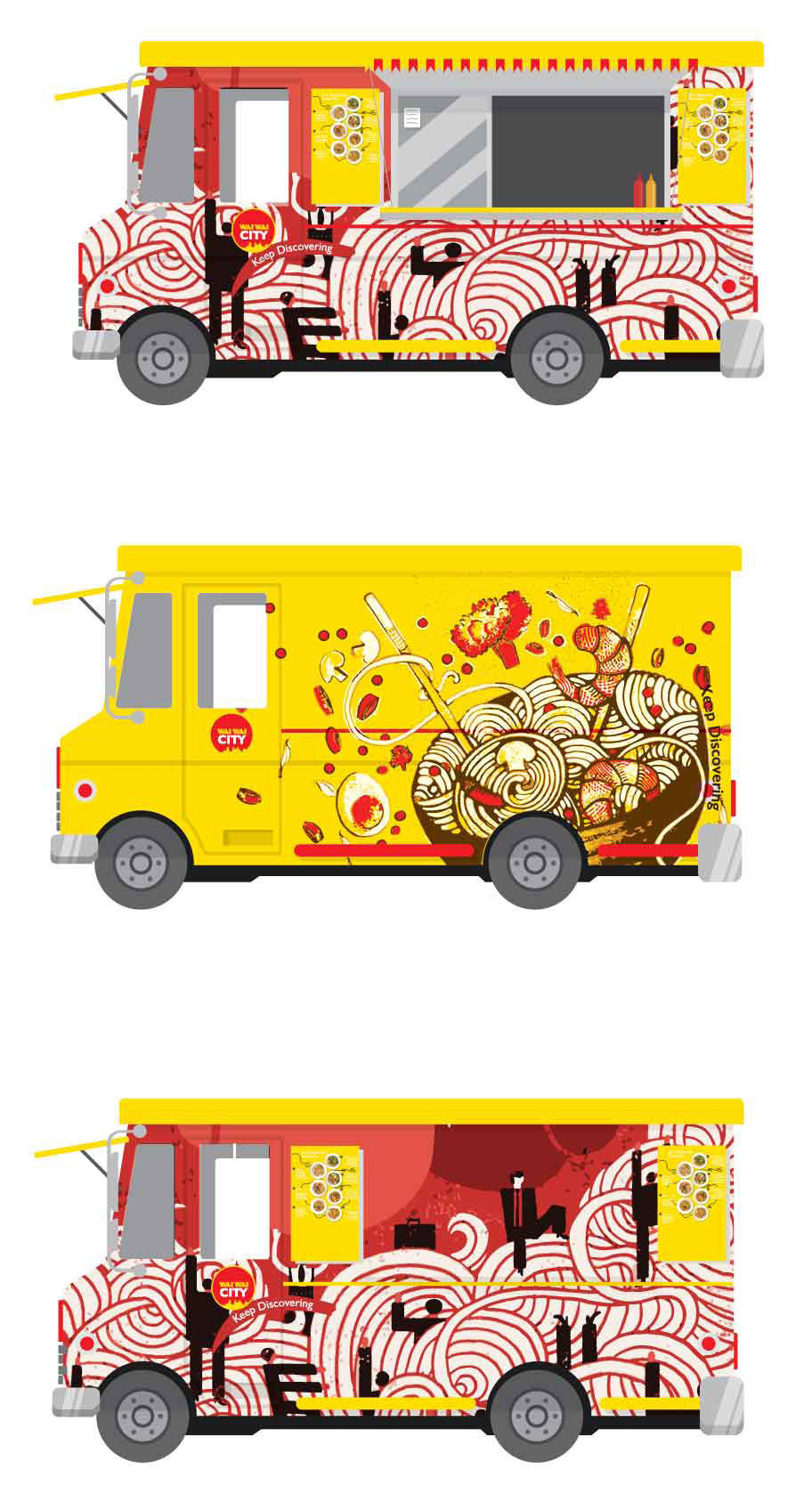
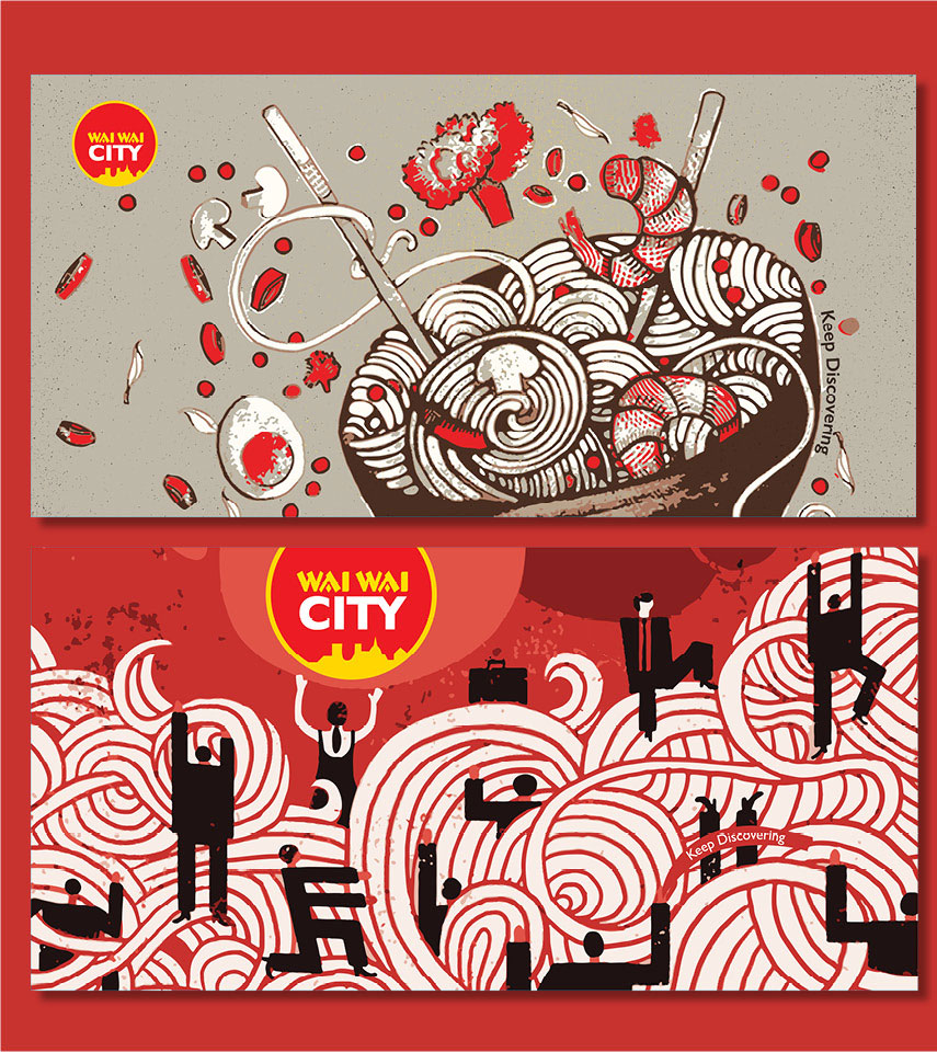
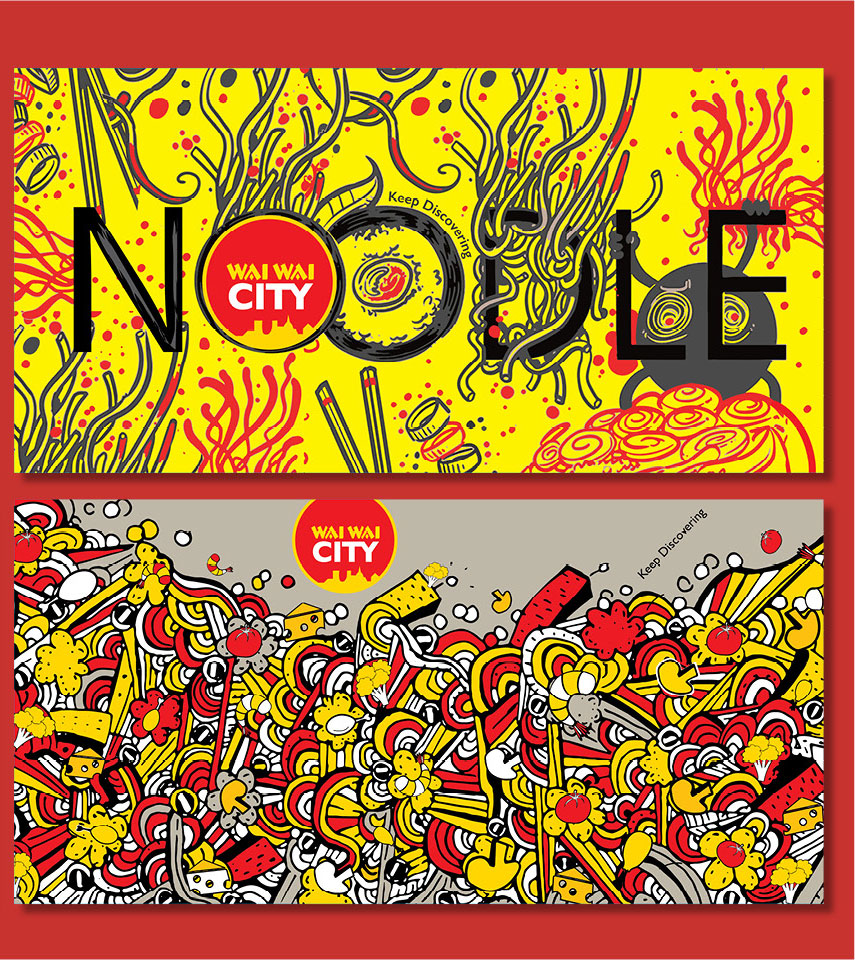
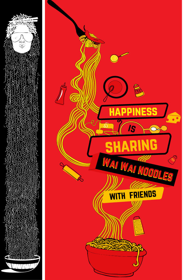
The restaurant is a quirky, youthful and simple look place. We
took noodles and the skyline of Delhi an inspiration for our
graphics and the colours came from the main Wai Wai brand
colours. The skyline was changes as per the city the cafe was
opening in.
This was an extensive project, we were involved in small nitty
gritties of the opening the first restaurant, which was then
expanded to different parts of the city and country. We worked
various models of the restaurant such as food court, kiosk,
event stall, small, medium and large sized area.